We spend so much time pushing pixels, tweaking performance, and squashing bugs. But then you look at the final thing and it just... feels off. Sound familiar? Here are few tips I've learn from talented designers I've worked with.
Whitespace
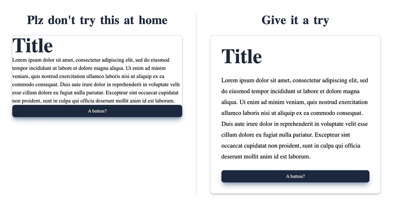
Whitespace is the empty space between and inside the elements of your UI. It’s the structural glue holding the whole layout together. Bunch of text in small space or placing elements too close together creates visual tension, leaving no room for your design to breathe
.
CSS Quick Fix
- Stick to relative units like
emorremfor yourpaddingandmargin.- Increasing
line-heighta bit (something like1.5em), it makes a massive difference for readability.- Try swapping
padding-leftandpadding-rightforpadding-inline. Same goes for top and bottom, usepadding-block. It just makes your layout adapt way better, especially if you ever need to support right-to-left languages.
Alignment
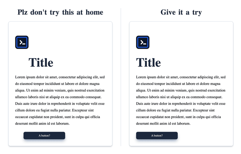
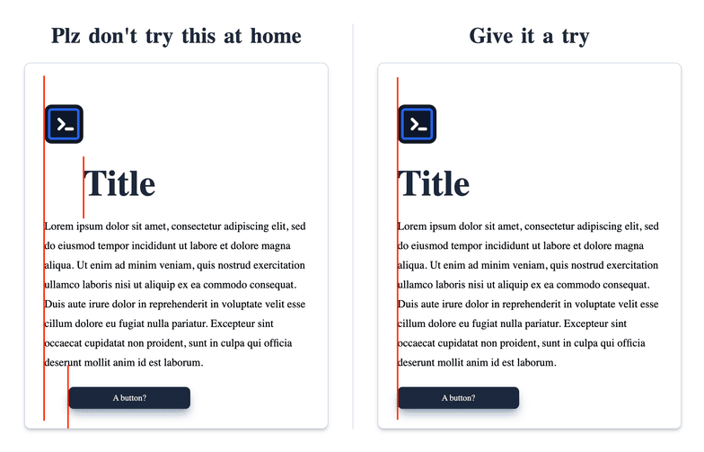
When stuff doesn't line up, our brains immediately flag the interface as messy. It just looks unprofessional. Getting your alignment right brings an instant sense of order and organization to the page.
Rule of thumb
Imagine an invisible grid over your interface, every component have a series of rows and columns, just ensure all of them align on a shared axis. Honestly, with modern tools like Flexbox and Grid, nailing perfect alignment is easier than ever.
Contrast & Accessibility
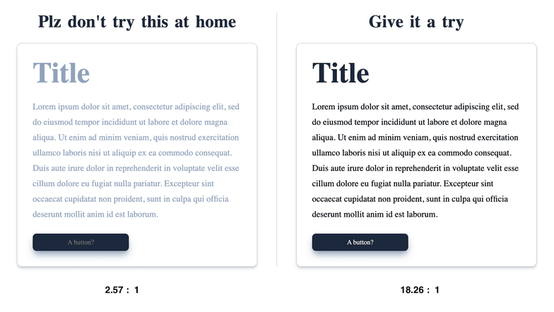
Look, if people can't read your text, the design is a break. Contrast is what makes your content actually pop out from the background containers.
Rule of thumb
Stick to the WCAG 2.0 contrast guidelines, aim for at least a 4.5:1 contrast ratio for standard text. Use browser extensions or developer tools to check your color contrast ratios and adjust your hex codes accordingly.
Scale & Visual Hierarchy
Scale is all about sizing. If every single button and text block is the exact same size, they're all just yelling at the user at the same time, competing for attention.
Visual hierarchy kind of ties everything together. It's how you establish an order of importance
so the user's eye naturally travels exactly where you want it to go, step by step.
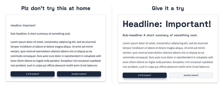
Tips
Figure out the absolute most important thing on the screen.
- If it's a primary button, give it a vibrant background color, bump up the padding, and make the text bold.
- If an element isn't that important (like a copyright disclaimer), push it to the background by dimming the color and shrinking the text down.
Typography
Good typography kind of just gets out of the way. Bad typography is super distracting.
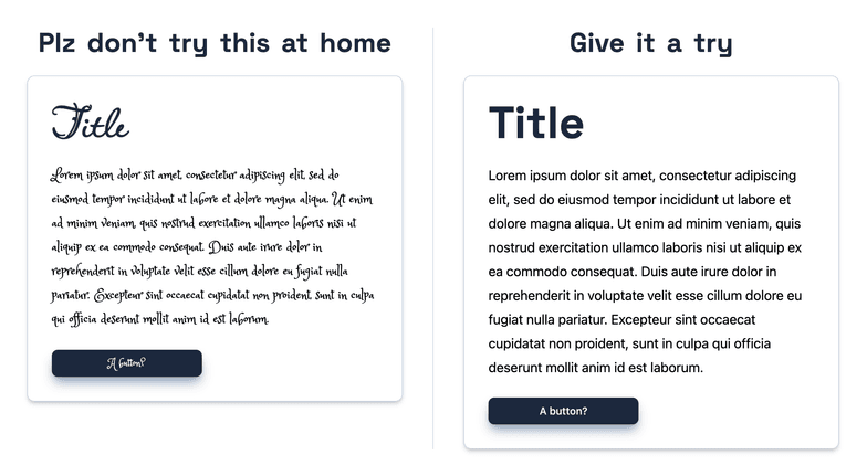
Tips
Keep it simple. You really rarely need more than 1 or 2 font families for an entire UI. Instead of throwing in chaotic new typefaces, just play around with
font-weight,text-transform(like uppercase for tiny tags), andletter-spacingto mix things up.
Color
Color hits the user instantly when a page loads. It basically sets the emotional vibe of the software. A harmonious palette makes the app feel trustworthy, while a chaotic one just feels jarring and stressful.
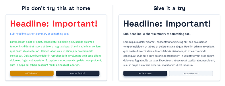
Tips
Less really is more here. The fastest way to wreck a good layout is to throw in way too many contrasting colors. Just grab one main brand color, and then use slightly lighter or darker variations of that exact same hue for your backgrounds and containers.